

Leveraging the power of our data with new reporting software
We recently introduced Power BI to Sapphire, a Microsoft Business Analytics service which provides interactive visualisations and business intelligence capabilities through a simple interface.
The great thing about it is that you can connect it to various data sources such as Excel, SharePoint lists, other software programs etc and pull together data from all those sources in to one dashboard. In some cases, you are even able to connect directly to a system and configure the Power BI dashboards to automatically suck the data out of the system and update the dashboard itself.
That’s great because once the report is created, it requires no further human interaction as it will update itself.
The benefits include:
- Vastly reduced labour time in the creation and production of reports
- Because there are no enormous Excel files being emailed all over the place, the stress and strain on the email network is vastly reduced
- With less time spent on producing reports, there is more time to act on the intelligence contained within them
- You don’t need to be an expert to produce an insightful dashboard. If the connections are there in the background and the data is clean, pretty much anyone can produce a great-looking dashboard
- Much larger scope in the type and style of reports that can be produced
- You can interrogate your data even if there are no formulas in place by using the Q&A tool. Just type in your question, such as “How many utility strikes were there in June 2021?”, and Power BI will return an answer
- You can access Power BI reports from any location, on any device, because it’s all cloud-based
- Enhanced data-loss prevention because there aren’t any physical files that can accidentally be deleted
- Excel has a limit on the amount of data it can handle – Power BI has no such limits
- You can combine many different types of data from many different sources
- You can report in real-time
- You can embed Power BI dashboards into other services. So, if you wanted to display a Power BI dashboard on your SharePoint site, you can do so
Our IT team are in the process of moving our existing Excel-based reports over to Power BI, alongside creating a whole host of new reports that will benefit the business. A couple of great examples are:
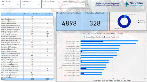
Plant Sheets Dashboard
This is a brand-new dashboard, created exclusively in Power BI. What we’ve done is automate the entire process!
Every day the Ops Managers and TLs receive an email from our Plant Sheets email address asking to confirm if the plant and equipment registered to them is still needed or not.
What we’ve done is connect the Plant Sheets email account to a SharePoint List, and there’s an automated workflow in the background that pulls through who received an email from the Plant Sheets address and who responded.
It then automatically puts all that into a SharePoint List and the whole thing happens in real time!
DNM Dashboards
These dashboards are a great example of what we can now do with Power BI. You can see from the dashboard that it gives you some high-level stats like how many surveys have been carried out in total, but if you select a week (or multiple weeks) from the dropdown menu in the top left it will change the entire dashboard to show you what was completed during that time frame.
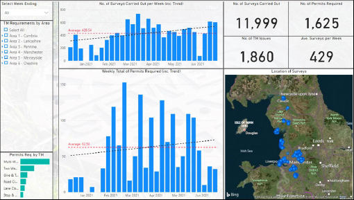
The best part of this dashboard is the map, which shoes you the location of all surveys which have been carried out. Finding out where permits are needed is shown on a map by simply clicking the top right permit button.
Similarly on the map it can show where Traffic Management is needed, while giving you a breakdown when hovering over a certain area of the map as pictured below.
It’s a great example of how powerful the insight capabilities on Power BI are. This was all generated just from connecting to Map16.


